The Converters: Creating a Visual Identity
We were approached by a client who needed a new logo for their rock band, The Converters.
The Client
The Converters are a local rock band with roots in classic rock, blues, and biker rock.
Their lead singer is known to say “Not bad for a garage band”…
They have a wide demographic for their audience, 25-60 years old.
Their Challenge
The client does not currently have a logo.
They understand the value that a logo represents, and want to create something iconic & stylistically similar to the Guns ‘n Roses logo.
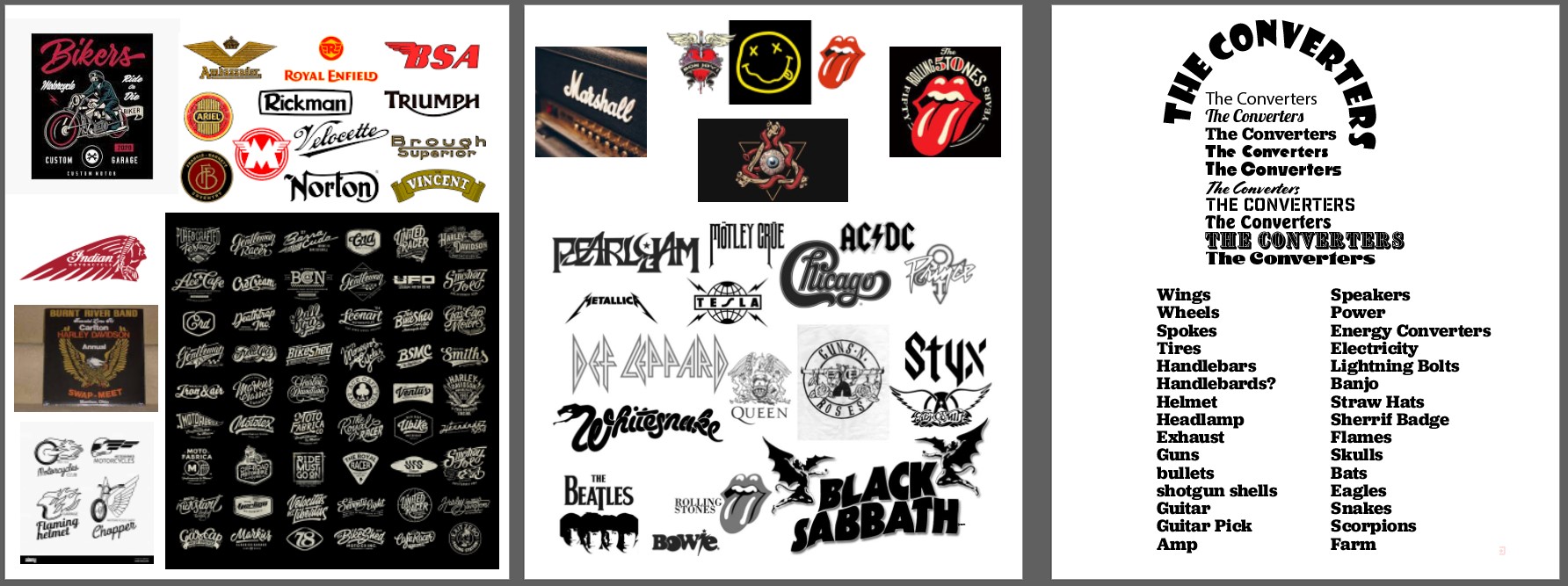
We started the design process by creating an artboard to identify the key features and styles that would inspire the design:
Our Solution
The Approach:
We knew we needed to hit a checklist: the logo had to say rock, it had to say biker, and it had to have a strong central icon. It had to appeal to a wide age range, and be functional for merchandise.
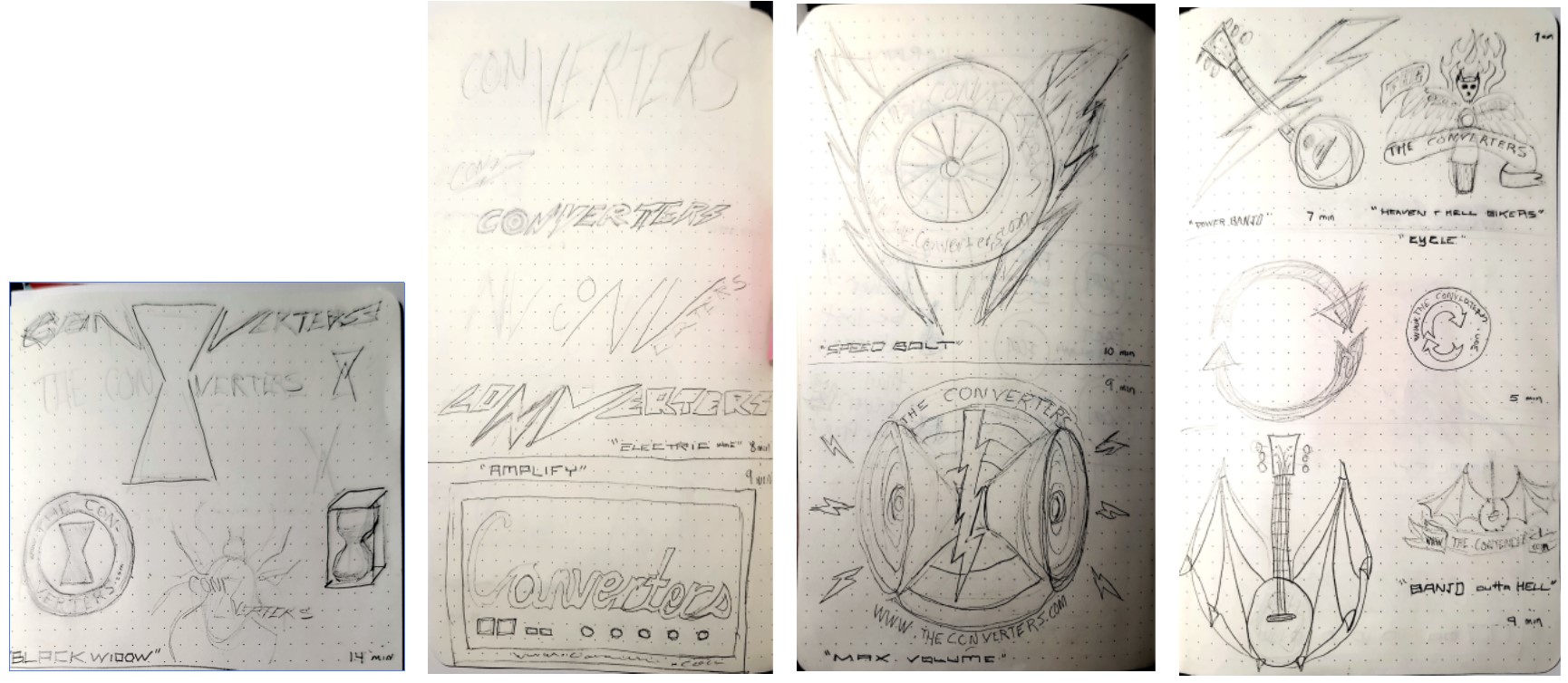
A series of short sketches that explored some of the concepts from the artboard helped move the design process forward:
We workshopped the ideas with the team of designers and found a couple stand-out concepts:
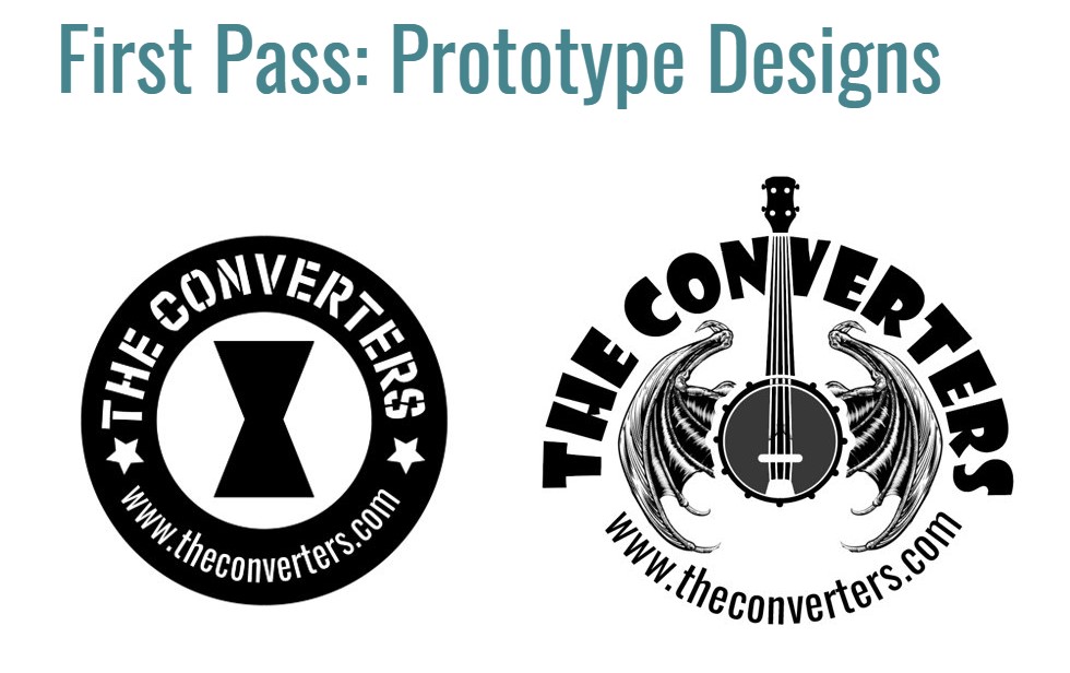
These two concepts hit on different aspects of the themes we were after. Unfortunately, neither one was strong enough on their own to push forward after we reviewed another round of feedback from the design team.
Our solution was to take the best parts of each & combine them into one logo:
This is a strong concept that delivers on the criteria & is highly functional.
It supports the bands website, which was a big request.
It has clear representation of being rock n roll related, the wings give it a classic rock vintage feel, and the skull-faced guitar has an upbeat attitude that will connect with the younger audience.
Next step was nailing a simple & bold color scheme:
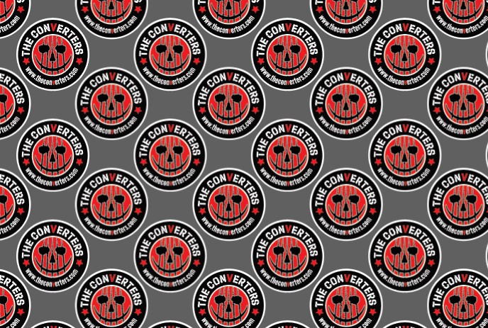
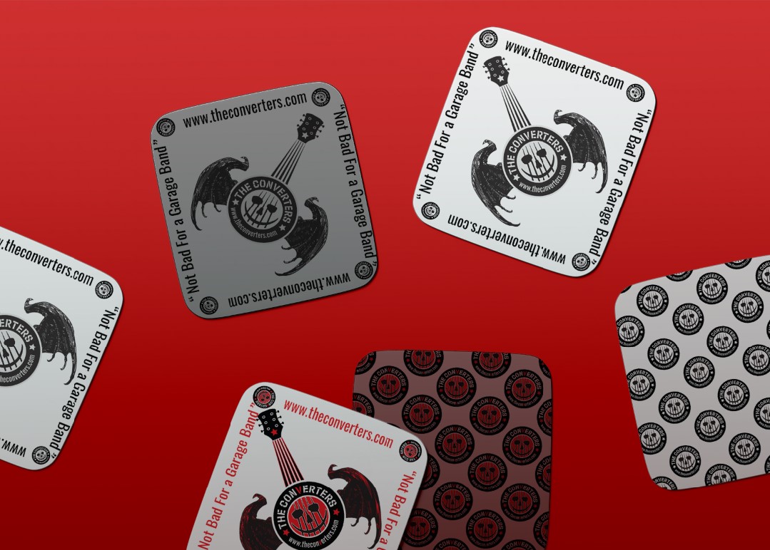
To give our client more value, more bang for their buck, we stripped down the Logo into several simpler versions of itself:
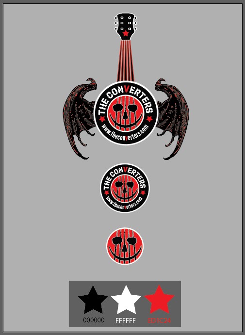
These “alt” logos give our client a lot of value, and you can really see the functionality of the logo at play.
The Circle Badge will work wonderfully for different practical merchandise applications, such as stickers, patches, embroidery, etc.
It will lend itself to an icon nicely for use on social media and web presence
The guitar skull face becomes a unique symbol representative of the brand and an almost “living” character that is identifiable. It becomes the “Wilson” volleyball, the Guy Fawkes mask, the “alt” smiley-face… an icon
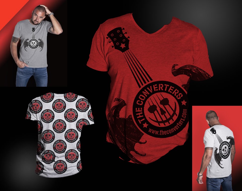
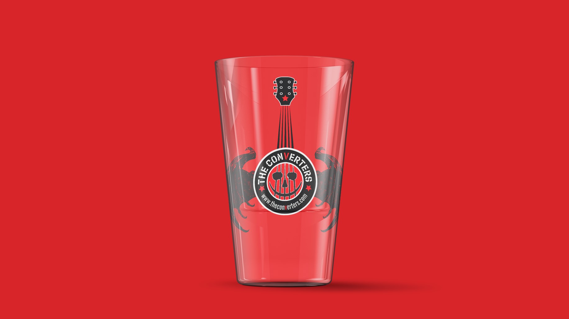
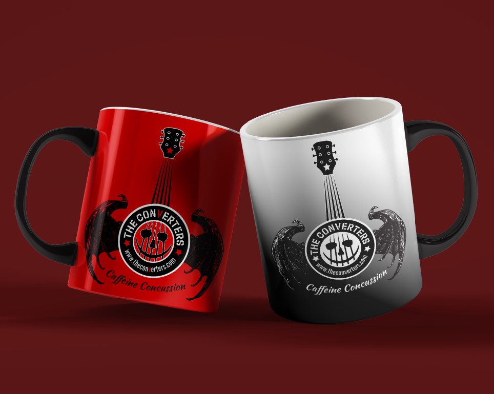
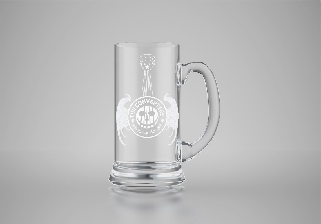
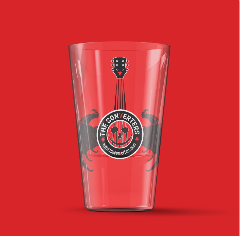
The Merchandise:
Tee Shirts, Hats, Beer Mugs, Coffee Cups…
We handle all of the account management & orders… our clients wave a wand at what they want their brand on, and we make it happen.
Whether you just need a prototype mockup or a 10,000 unit tee shirt order, we’ve got you covered

The Verdict:
Our client loved the design, but they also valued the full service solution.
We didn’t just stop at meeting their initial request, we looked forward to their business needs, how they would need to use this logo in practical applications to support their marketing & merchandise campaigns…
We take the full vision of our client’s needs into consideration, so that we create solutions to problems the client hasn’t thought of.
That’s how we deliver value to our clients.
That’s MadFish!
Need a hand with your business identity? Let’s chat about how we can build your brand!